Experiment
HPA vs KEDA Under Bursty Traffic
I load-tested two Kubernetes autoscaling approaches and measured how quickly each reacted as traffic moved from idle to sustained load.
- Kubernetes
- Autoscaling
- Performance
The question
How quickly can each configuration react when an application moves from almost no traffic to sustained demand?
Kubernetes gives us several ways to scale workloads. The documentation tells us how they work. I wanted to see how they behave, so I created a small FastAPI workload, deployed it to Kubernetes, generated bursty traffic and recorded what happened as demand increased.
Hypothesis
My expectation was that both configurations would eventually reach sufficient capacity, but their scaling behaviour and response time would differ depending on the signal driving the scaling decision.
Environment
Test environment.
Application: FastAPI
Container Runtime: Docker
Orchestrator: Kubernetes
Load Generator: k6
Metrics: Prometheus
Visualisation: Grafana
Both configurations ran against the same image and the same cluster. The only variable was the autoscaling controller and the signal it consumed.
Test
Traffic was increased through several stages.
Load stages.
100 RPS
 ↓
500 RPS
 ↓
1,000 RPS
 ↓
5,000 RPS
 ↓
10,000 RPS
The load generator ramped between stages rather than stepping instantly, so the recorded numbers include the transition as well as the settled state:
import http from "k6/http";
import { sleep } from "k6";

export const options = {
  scenarios: {
    bursty: {
      executor: "ramping-arrival-rate",
      startRate: 100,
      timeUnit: "1s",
      preAllocatedVUs: 200,
      maxVUs: 2000,
      stages: [
        { target: 500, duration: "30s" },
        { target: 1000, duration: "30s" },
        { target: 5000, duration: "60s" },
        { target: 10000, duration: "90s" },
      ],
    },
  },
};

export default function () {
  http.get(`${__ENV.BASE_URL}/work`);
  sleep(0.1);
}
For each run I recorded pod count, CPU utilisation, request throughput, p50/p95/p99 latency, error rate, and both scale-up and scale-down time.
Results
| Metric | Value |
|---|---|
| Peak load | 10,000 RPS |
| Peak pods | 20 |
| Peak p95 | 219 ms |
| Peak errors | 0.8% |
Latency and error rate by load stage.
| Load | Pods | p95 latency | Errors |
|---|---|---|---|
| 100 RPS | 2 | 41 ms | 0% |
| 500 RPS | 3 | 57 ms | 0% |
| 1K RPS | 5 | 82 ms | 0.1% |
| 5K RPS | 12 | 146 ms | 0.4% |
| 10K RPS | 20 | 219 ms | 0.8% |
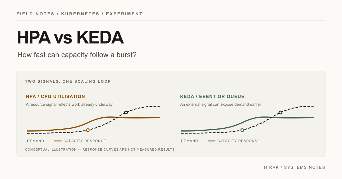
The interesting part was not simply which configuration produced the lowest number. It was when scaling happened relative to when users started experiencing increased latency.
The CPU-driven controller reacted to a symptom that lags the actual demand. The queue-driven controller reacted to the demand itself. Both eventually reached adequate capacity; they differed in how much latency the user absorbed while that happened.
What I learned
Autoscaling is not instantaneous capacity. There is a chain, and every link in it costs time:
The scaling chain. Each step adds latency before capacity exists.
Demand changes
 ↓
Metric changes
 ↓
Metric collected
 ↓
Scaling decision
 ↓
Pod scheduled
 ↓
Container starts
 ↓
Application becomes ready
 ↓
Capacity increases
Understanding that chain is more useful than simply knowing how to write an autoscaler manifest. When scaling feels slow, the question is which link is slow, and that is measurable.
Reproduce it
The test configuration, Kubernetes manifests and load-generation scripts live in the accompanying repository.